Vitamin D Prophylaxis Can End The Pandemic

We have been calling for vitamin D to be used to fight COVID19 since March – now seven months. The evidence was overwhelming then but fell on deaf ears.

We published a preprint of a formal proof that vitamin D could end the pandemic six weeks later in May, urgently calling for goverments to use it as a primary tactic to fight the corovavirus pandemic and prevent a second wave.

It’s now October. The evidence is simply undeniable. Their refusal to acknowledge the mountain of evidence is inexplicable. Are UK Government leaders really this scientifically illiterate?

How Effective Is Prophylaxis?

We didn’t attempt to quantify how effective vitamin D prophylaxis would be, however, previously published models can be used to inform estimates. An Italian paper from 2008 modelled the relative effects of restricting air travel, vaccination and using anti-viral prophylactics to compare them:

Left Panel from Figure 3
Clinical AR, by control measure and scenario (R0 = 1.7).
black = baseline results; light blue =  90% air travel restriction; violet = AVP to household contacts; blue = vaccination, administering first dose within 3 months of the first world case for R0 = 1.7; grey = 90% air travel restriction+vaccination, as reported for the blue line; green = all control measures combined; red = all control measures combined, extending AVP to school/work close contacts.
Source: Mitigation Measures for Pandemic Influenza in Italy: An Individual Based Model Considering Different Scenarios

This model assumes the efficacy of anti-viral prophylaxis (AVP) at around 70%. It modelled its use only in restricted populations in contact with infected individuals at home and in schools. Even under these conservative assumptions, prophylaxis was by far the most effective tactic.

All evidence suggests Vitamin D would be even more effective than this.

Panacea? Silver Bullet?

I’m sick of hearing vitamin D is not a panacea or a silver bullet.

Everything we know suggests that Vitamin D Both Protects Against And Treats COVID19. We can give it more widely than traditional anti-viral prophylaxis: to entire populations.

This implies that it has the power – by itself – to end the pandemic and all lockdown measures. If this isn’t a panacea or silver bullet, then what is?

It is cheap , safe, and immediately actionable. There is no justifiable reason not to use it. All evidence suggests it should be the #1 tactic used in the pandemic management strategy.

Help End COVID19 Now

Help save lives, end the pandemic & unnecesary social restrictions:

  • Print and Share these Vitamin D Awareness Posters with schools, businesses and workplaces.
  • Share this information with your MP, political leaders and policy makers.
  • Click to Tweet, or share on other social media using the hastags #COVIDEndsWithD #JustD3It #4KADayKeepsTheDoctorAway #VitaminD #COVID19 and the link bit.ly/vitd3info or this article.
Vitamin D Awareness Poster

Latest Research: Vitamin D Protects Against and Treats COVID19

I joined an expert panel talk, organised by Rufus Greenbaum, along with three other experts, Professor Michael Holick, Dr William Grant and Dr David Grimes, to describe the latest findings from research on vitamin D and coronavirus.

We showed definitively that higher blood levels of the steroid pre-hormone Vitamin D helps to:
1. Reduce risk of catching coronavirus
2. Reduce the severity of the illness


Watch on YouTube.

0:00:00 Professor Michael Holick, Boston University, describes a major study published that tested 190,000 patients for Vitamin D and Coronavirus which showed the risk of catching coronavirus is reduced by half if serum levels are sufficiently high.

0:22:30 Dr William Grant gives an overview of many other trials around the world.

0:38:36 Dr Gareth Davies describes how his team used an analysis drawing on methods from Physics, Data Science and Artificial Intelligence to prove that vitamin D deficiency causes severe COVID19 disease in response to the Sars-Cov-2 virus. Their two part analysis looked at 1.6 million data points of deaths and recoveries from all 240 global reporting locations. Additional evidence from known biochemical pathway and historical food fortification add more confidence to an already very high-power result.

0:50:56 Dr David Grimes shows how Bradford Hill’s criteria have been met by many other observational studies already.

1:09:20 Rufus Greenbaum shows outlines Key Facts, Health Outcomes and Next Steps required in the UK to make major reductions in the infection rate.

The Science Is Clear

Vitamin D Prophylaxis Can End The Pandemic. We’ve known this since March and called for action but governments and their advisory bodies appear to be asleep at the wheel, ignoring all of the science as hundreds of studies confirmed our research.

Don’t wait for them. Protect yourself now.

We recommend that all adults take 4,000 IU/day (100mcg) of cholecalciferol, or vitamin D3. It’s cheap, safe and widely available.

Children, underweight and overweight adults should consider taking a dose tailored to their weight. This D*Calculator can tell you exactly what to take if you supply your weight and a desired serum level of 50ng/ml.

Please share this information with your family, friends and network using these hashtags #COVIDEndsWithD #JustD3It #4KADayKeepsTheDoctorAway #VitaminD #COVID19.

You Can Help End COVID19 and Lockdown

  • Print and Share these Vitamin D Awareness Posters with schools, businesses and workplaces.
  • Share this information with your MP, political leaders and policy makers.
  • Click to Tweet, or share on other social media using the hastags #COVIDEndsWithD #JustD3It #4KADayKeepsTheDoctorAway #VitaminD #COVID19 and the link bit.ly/vitd3info or this article.

Are we having a second wave? Of stupidity, yes.

Are we having a second wave of COVID-19? No! We haven’t even finished the first wave yet, and a second wave – if it happens* – wouldn’t start until winter.

So, why did Matt Hancock tell us we are?

Because the UK government and their advisors are scientifically illiterate.

* 2021 UPDATE: I was clearly too optimistic that the government would have understood the science by winter and rolled out correct vitamin D advice. If they had, we would have avoided the second wave. What a crying shame.

Science and literacy

Matt Hancock is a highly intelligent man, educated at one of the world’s leading universities, but his BA in Philosophy, Politics and Economics from Exeter College, Oxford, and his MPhil in Economics does not make him scientifically literate. How could it? This is quite clear from his bizarre interpretation about what is happening which is scientific nonsense. Blunt? Harsh? Yes, perhaps, but then again he is scientifically illiterate and making terrible, terrible mistakes. Only a science education in the appropriate sciences could make him literate. That’s how education and literacy works.

The Good, the Bad and the Ugly

Governments internationally continue to chase red herrings, reporting and reacting to “detected infections”, and in doing so, creating panic and hysteria, untold economic damage and inumerable deaths – almost ALL of which has been entirely unnecessary and avoidable – if only they had paid attention to good science.

Unfortunately, there seems to be an almost ubiquitous dis-ability to distinguish good science from bad science, and either from complete nonsense. No-one would expect the general public to have this ability, but it’s deeply troubling to see this at goverment level.

“Detected infections” is a meaningless metric.

I repeat: “Detected infections” is a MEANINGLESS metric.

EVERYONE, PLEASE STOP USING IT, READING ABOUT IT, AND SPREADING MISINFORMATION. It cannot be interpreted meaningfully and it should never be used to guide policy or strategy. That. Is. Insane.

It tells us nothing useful about actual infections, nor how dangerous a disease currently is. The fatality rate of COVID-19 is not a constant but varies over time and place enormously in response to changing conditions.

Deaths is a meaningful metric, despite some uncertainty around reporting, it is one of the most reliable metrics we have and usually comes from hospitals.

Recoveries is also meaningful, so long as it’s coming from the same source so we can compare like for like.

However, there are better metrics available.

Angels and Devils

Absolute (as opposed to relative) values for deaths and recoveries are useful within countries or states but since these depend on things like population, population density, economic factors, transmission rates (which can change enormously on a daily basis) etc. etc. we cannot compare these with other locations unless we make very complex adjustments.

There are lots of ways to adjust if you know all the various influencing factors, but we actually don’t know what all those factors are.

However, there’s also a neat trick which allows to sidestep this need completely.

Dimensionless entities

A dimensionless number is a concept from physics.

Roughly speaking, dimensions are units – things like metres, seconds, and so on and combinations like metres-per-second, virions per litre, deaths per million.

So, metrics like velocity and acceleration have dimensions, and so do deaths and recoveries (and detected infections). These dimensions are very important to know and help to make meaningful comparisons.

There is a higher form of metric which has no dimensions, existing in a kind of heaven of perfection. They’re so good they’re like the angels of the world of metrics, quite unlike “detected infections” which is an evil devil – misleading everyone and causing mayhem.

Why are dimensionless metrics so good?

Not having dimensions imbues them with a truly magical quality: we don’t need to make any adjustments to them when we want to make comparisons! Angelic!

Why is this so? And what’s an example?

Let’s look at total deaths for a country. This looks like a number without dimensions, but it isn’t. It actually has many complex-yet-unstated dimesions to do with local conditions – population, population density, socioeconomic and health care conditions, demographics and so on. These all vary by location and over time and it would confuse everyone if we figured out these dimensions and started referring to it using them. Imagine it: deaths per place, date, season, weather, wealth, population, density, weather, healthcare quality… etc. so we can see that deaths is actually highly dimensional.

Which country has had the highest deaths per capita? Do you know?

It’s Belgium. Surprising huh? But is this really meaningful? We’ve only adjusted for one of the dozens of possible dimensions we need to in order to compare. So, no, it isn’t.

Fortunately, there’s a trick to get rid of all dimensions – whether we know them or not!

We use ratios. Ratios are heavenly. Whenever we divide any two metrics with the same dimensions, the dimensions cancel out! This is analagous to multiplying fractions like:

  \frac{2}{4} \times \frac{4}{2}

the 4s cancel and the 2s cancel, so this is simply 1.

Recoveries and Deaths for a location have the same dimensions, so their ratio is dimensionless, ascending straight to number heaven. We can use this ratio to make meaningful comparisons across territories and over time. Magical!

Ratios can be tricky devils if we accidentally divide by zero. A convenient way to handle this with numbers like deaths and recoveries is to add 1 to the denominator since they can’t be negative this guarantees we never have a value of zero on the bottom.

Dimensionless Fatality and Recovery Rates

We can see how fatal COVID-19 is by using the metric

  \frac{deaths}{(1 + recoveries)}

Let’s call this the Dimensionless Fatality Rate, or DFR. The most reliable source of deaths and recoveries is from hospitals and the hospital case fatality rate is the number of people admitted to hospital that die expressed as a rate. The DFR for hospitals in a state or country is a perfect, credible and comparable metric.

(I extended this concept significantly when I created the Epidemic Severity Index, the maths is more complex but DFR was the starting point for it).

We could flip this to think of recovery rates instead: the Dimensionless Recovery Rate or DRR is R/(1+D).

Dimensionless Fatality Rate and Dimensionless Recovery Rate

Let’s look at some examples to get a feel for how the DFR behaves: when there are no deaths and no recoveries its value is 0.

When there is 1 death, its value rises to 1.

If two people were admitted and the other recovers, then DFR goes down to 1/2.

For seasonal flu, about 1 in every 13 hospital admissions dies and the other 12 recover, so the DFR for seasonal flu is 1/13 or 0.077 (quite low, but still pretty scary). At the peak of the pandemic countries, experiencing bad outbreaks had a much higher DFR of around 0.5. However, countries that did not have bad outbreaks had much lower DFRs.

Small numbers are hard for our intuition, so let’s look at recovery rates, or DRRs, instead.

Seasonal Flu has a Dimensionless (hospital) Recovery Rate of 13. So, any value less than this means fewer people recover and the disease is more fatal. Anything higher than 13 means the disease is less fatal than seasonal flu and therefore we don’t need to be panic and enact stupid lockdown rules.

COVID-19 had a DRR of approximately 2.0 at the peak in Europe – that’s much more fatal than flu and a lockdown was well-justifed then. However, Japan’s DRR was 7.2 at the end of March so their C19 oubreak was only about twice as bad as seasonal flu! Two months later their DRR had risen to 16 and the disease was LESS SEVERE seasonal flu. By July 28th the daily DRR was an incredible 167 and the overall DRR had risen to 23. Japan’s COVID-19 outbreak was much less fatal than seasonal flu in the US. (I’ll explain why later).

Let’s see DRR calculated for some countries of interest on three key dates: 28 March, 28 May, and 28th July. We’ll look at the daily DRR and the overall DRR. Daily values can fluctuate and be unstable but it’s still illustrative to see what’s been going on.

Dimensionless Revovery Rates tell a very different story to the red-herring “detected infections” that Matt Hancock is chasing.

The UK’s current daily DDR is now almost as good as seasonal flu in the US. It’s rising all the time and we no longer need to be enacting lockdown.

This is why good science is so useful. It tells us what we should be doing. If governments were more scientifically literate and listened to me (and people like me) we would have gone into lockdown on the 10th March and we could have come out of it in May! We didn’t and could’t because they refused to look at vitamin D deficiency despite us proving that vitamin D deficiency is causing people to die of COVID-19. In fact, I had worked this out by March 19th and those who trusted the documented evidence for this that I circulated back then are still alive. Thankfully the documents went viral globally, so hopefully we saved millions of people from dying through our actions. If the goverment had listened, this would have all been over very quickly and with orders of magnitude fewer deaths.

Let’s look at DRR for more countries:

Why did countries have such different severities of COVID-19 outbreak? Vitamin D deficiency variation is the primary reason.

Finland is fascinating. Sadly, it was infected too late to include in either my paper explaining the Epidemic Severity Index and our proof that vitamin D deficiency causes poor COVID-19 outcomes, but I kept an eye on it because it’s the only country in Europe that has an effective vitamin D food fortification programme. It’s living proof this works: Finland has had 329 COVID-19 deaths and 6,950 recoveries at the time of writing.

Finland has an effective vitamin D food fortification because it’s so far north.
Just 329 deaths and 6,950 recoveries. That’s far less fatal than seasonal flu in the USA!
Source: https://covid19info.live/finland/

Everyone outside the tropics (30°S to 30°N) should be taking vitamin D supplements throughout winter and in fact, I believe all year round. I take 4,000IU per day and I had a very mild experience. In fact, if I hadn’t known the symptoms so well, I probably wouldn’t have even noticed I was ill. My 94 year neighbour, Alan, has been taking vitamin D since Christmas because he has dementia and I knew it would help, so I buy it for him. It does. It’s helped him recover from 5 hospitalisations due to UTIs over the last year including 1 hospitalisation and two care homes at the peak of the pandemic. He’s COVID-19 negative and recovering well at home now with a live in carer.

My neighbour Alan, 94 years young, at home again and vitamin D sufficient! He’s on the left, I’m on the right. 😉

If everyone is vitamin D sufficient, we will not have a second wave.


Newtonian physics IS deterministic (sorry Norton)

A ‘thought experiment’ called The Dome published in 2003, claims that Newtonian physics can be shown to be non-deterministic. Shocking, huh? Not really. Mathematical singularities crop up all the time in physics and represent points where the model breaks down. We handle this by excluding them.

Newton’s laws are deterministic, but they’re not complete.

My initial reaction to Norton’s Dome was quite disparaging because his non-deterministic ‘solution’ is so antithetical to anything a physicist would construct. It jumps out as immediately wrong. However, I’ve learned a great deal from thinking about it. It contains several surprises. What more can we ask of a thought experiment? I’ve come to think it’s a little gem.

Norton’s Dome

Norton deserves credit for constructing such a clever set-up. It hides from sight – in the attic of higher order differential forms – what would otherwise be a perfectly obvious flaw. We’ll take this error down and dust it off in plain view in a simpler but equivalent form to expose it. The dome also turns out to have some very interesting mathematical (geometric) properties which have proven to be very effective red-herrings.

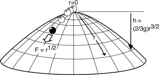
Imagine a dome of a certain shape which is perfectly symmetrical. Atop the dome, sitting at the precise vertex sits a point-like mass (represented by a sphere in the drawing so we can see it). The surface is perfectly slippery (no friction forces). The only force acting on the mass is gravity and the dome is fixed and unmovable.

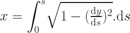
The shape of the dome is given by the equation in the diagram.

dome_with_eqn

Since gravity is the only force acting, it can only push the particle in a direction if the particle is somewhere other than the apex. At the apex, the force from the dome goes straight up, is equal an opposite to g, so the particle doesn’t move at all. Everywhere else, the force is at the angle of the dome’s surface and so a fraction of g will be sideways. Note that h is measured down from zero at the top of the dome, and r is the length of the arc along the curve from the apex to the point, and not the horizontal distance from the apex.

Norton’s set up is somewhat cavalier and needs some fixes, but none are fatal to his argument and so we’ll fix them in a bit just to clear them out of way. But first, let’s get into the problem as he argues it.

The radial force on the particle – that is the force in the direction along the dome’s surface away from the apex – is given, according to Norton, by:

 F = g \frac{\mathrm{d}h}{\mathrm{d}r} = r^{1/2} = \sqrt{r}

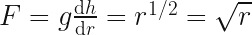
(If you’re a physicist you may be cringing at several problems already but bear with…)

Now, from Newton we know F = ma, which along the arc is:

  F = m \frac{\mathrm{d}^{2}r}{\mathrm{d}t^2}

We can set the mass to 1 for simplicity, and so:
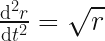
  \frac{\mathrm{d}^{2}r}{\mathrm{d}t^2} = \sqrt{r}

Clearly at the apex, r = 0, there is no force, no acceleration and the particle stays still, so r(t) = 0 and this is obviously the trivial solution to the above equality.

This is where Norton gets tricky with us. He posits another solution to the equation above, where, for some arbitrary time, T:

 r(t) = \left\{\begin{array}{cc}\frac{1}{144} (t-T)^4 & t > T \\ 0 & t\leq T \\ \end{array} \right.

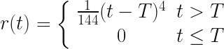
It’s easy to check that both parts of this function are correct solutions. You can differentiate the solution twice and check if you feel like it. We’re expected to accept them both as Newtonian. It seems that way, right? because they’re solutions, but in fact the top equation is not Newtonian at the apex (clearly since it moves despite the absence of a force there).

Norton however, having stitched this monster up, interprets it as meaning that the particle can simply start shooting off down the dome’s side after an arbitrary time and with no apparent cause.

This is baffling. It’s bizarre to stitch two different solutions to an equation together using an arbitrarily chosen boundary and then claim it still represents something physical.

Norton, however, starts referring to time T as the ‘excitation’ time, attempting to slap some physics-esque linguistic make-up on his Frankenstein creation to try to pass it off.

I will get round to showing just how absurd and unphysical it is to stitch solutions together in this way, but first we need to fix up the problem statement and also dig deeper. Where did this other solution come from? What does it represent?

There are various additional issues that are unphysical which could be distractions. We want our vision as clear as possible, but also this dome shape turns out to be a great deal more interesting than it first looks!

Let’s get physical!

1) Dimensions

You may noticed the equation for the height of the dome has the wrong dimensions. It should have dimensions of length (L) but instead has L^{5/2}T^{-2}. This is easily fixed with a constant factor, k, with dimension of L^{-3/2} T^2. Since we can set this constant to 1 this is a little pernickety but best have it out the way.

2) Infinite force?

Gravity is the only force acting, and yet somehow we’ve ended up with a force equation that scales unbounded as the square root of r. The maximum force the particle can experience is g which coincides with the dome surface being vertical. So how on earth have we ended up with the force scaling unbounded as the square root of the arc length?

It could easily sneak past the casual reader that the surface described the equation isn’t physically possible over all r. This is very easy to miss because we’re shown a mixed coordinate system which is looks Cartesian, but in fact isn’t.

If we had been given a curve expression in terms of x and y we could more easily see where the curve behaves strangely, but he’s given an unusual one mixing the arc length with height which hides some very bad behaviour:

As r increases, there comes a point where the height (or rather depth) equals and then exceeds the length of the arc!

Take a moment to think about that.

The length of an arc of a curve is always going to be longer than its depth or width. It can equal either – if it happens to be a straight line – but how can an arc ever that started out longer become shorter in total length than its height? There is no curve we can draw where the arc length is less than its height:

arc-always-longer

The only case where it can even equal the height is is the case where it drops straight down. Yet the curve equation we’ve been describes a shape whose depth rapidly starts to exceeds its arc length. Clearly this isn’t physically possible without bending space itself. An interestingly shaped dome indeed!

We must impose a constraint on the dome equation to stop this. The rate of change of the height can never be allowed to exceed the rate of change of the arc length. We can express this geometric constraint as:

 \frac{\mathrm{d}h}{\mathrm{d}r} \leq 1

which gives us

 \frac{k \sqrt{r}}{g} \leq 1

or

 r \leq \frac{g^2}{k^2}

This is fine. So long as our dome is cut off before this point, then at least it’s physically possible.

Norton doesn’t appear to have noticed or at least doesn’t point out the pathological nature of his dome’s surface but it doesn’t matter as we only need to consider the dome near the apex anyway.

(The curve also turns out to be pathological at the apex in a far less obvious way, and some have focused on this as the flaw in his argument. It’s interesting but we don’t need go into complex mathematical arguments about Guassian curvature or Lipschitz continuity to dispatch this monster.)

Frankenstein’s Equation

Okay, so given that the two equations Norton has supplied are easily shown to be correct solutions to the equation, why is his stitched-together version of them flawed?

Being a valid mathematical solution to the equation isn’t enough to ensure we have a valid physical model. This will become very obvious in a moment but first we need to see that the two equations differ in a very important respect. The both represent different physical solutions. One is the motionless particle, but what does the other solution physically represent?

Well, it’s one of the many possible “equations of motion” for a particle on this Dome’s surface. In this case, it happens to describe a trajectory passing through the apex. This is the first clue that this is a non-Newtonian solution: it describes the particle sliding off the apex despite it having zero velocity and zero acceleration there!

If we look at negative time, it also describes the particle shooting up the curve up, over and through the apex. The point when the particle is exactly on the apex is when t = T and you can see that r becomes zero.

The inclusion of T in the equation here is a red-herring. All it does is offset the moment when the particle passes through the apex. If it’s 4, then the particle will be at the apex when t = 4.  Remember we don’t have to start at time zero, since the choice of what to call zero is arbitrary. Negative times are just as valid here, and they just describe the particle’s motion before the time we arbitrarily called zero.

We can calculate the velocity of the particle easily enough, just by differentiating with respect to time:
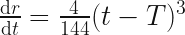
 \frac{\mathrm{d}r}{\mathrm{d}t} = \frac{4}{144}(t - T)^3

This tells us that at time t = T, the velocity is zero too.

Now, at first this might be surprising. If the velocity is zero and the position is zero at time ‘zero’ (i.e. t = T), then how come this solution shows the particle moving at all other times? How does it ever get off the apex once it’s there? If no there’s no acceleration or force at the apex, and the particle has zero velocity there, then how can it possibly move away?

First, let’s confirm the acceleration is zero by differentiating again:
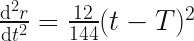
 \frac{\mathrm{d}^2r}{\mathrm{d}t^2} = \frac{12}{144}(t - T)^2

This is also zero at time t = T, which we expected since we set up the whole system this way.

So it’s true that the acceleration and velocity is zero at this one instant in time but they are not the whole picture. If we keep differentiating, we can see that the rate of change of acceleration (called ‘jerk’) is zero too:

 \frac{\mathrm{d}^3r}{\mathrm{d}t^3} = \frac{24}{144}(t - T)

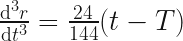
But if we differentiate one more time to get the rate of change of the jerk (sometimes called snap, or jounce) we’re in for a surprise, because we see immediately that this is non-zero at all times:

 \frac{\mathrm{d}^4r}{\mathrm{d}t^4} = \frac{24}{144} = \frac{1}{6}

Jounce, or snap, is the ‘acceleration of acceleration’.  It’s perfectly reasonable for it to be non-zero in real physical situations (fun fact: jerk and snap are quite important considerations when designing roller coasters), but in a real, complex system its value would come from a complex interplay of forces and structures.

According to this (mathematically correct) solution to the differential equation, the particle acquires acceleration at an accelerating rate at all times and positions on the dome.

So is this solution Newtonian? I don’t see how since it violates the Newton’s first law:

Lex I: Corpus omne perseverare in statu suo quiescendi vel movendi uniformiter in directum, nisi quatenus a viribus impressis cogitur statum illum mutare.

“An object at rest will remain at rest unless acted upon by an external and unbalanced force. An object in motion will remain in motion unless acted upon by an external and unbalanced force.”

Implicit in this statement is that if the force is zero, then all higher orders of the force must also be zero to ensure the acceleration, despite being zero, isn’t changing.

This raises deep questions about how we want our model particles to behave in this unusual condition. Should the particle move? If we want to preserve time-symmetry then answer is yes. If we want to strictly preserve Newton’s laws the answer is no.

Conservation of Energy

Just because we have an equation that is the solution to a differential equation does not mean that it represents something physical over its entire range. Just as the dome equation becomes physically meaningless beyond a certain apex length, Norton’s motion equation isn’t valid over its full range. It describes a path that fits a mathematical constraint but that path does not, in fact, match the expected trajectory of the particle.

Physics cares about maths, maths really doesn’t care about physics.

We must make it care, by applying appropriate constraints and conditions wherever we notice it no longer represents something physical.

For example, at first glance it would appear that energy is conserved over the whole path. We can calculate the drop in potential energy for the particle at any point on the dome surface, and we can calculate the (apparent) kinetic energy at that point and they appear to match, but if we consider the complete drop energy is not actually conserved:

The force in the horizontal direction is always positive. This rises from zero at the start, and reaches a maximum as the particle slides past the point where the component is more down than sideways (a dome angle of 45 degrees). After this point the particle continues to accelerate horizontally but that acceleration decreases. The horizontal kinetic energy reach some positive maximum value.

According to Norton’s equation though, the value for kinetic energy at r = g^2, where the dome ends, is exactly equal to the drop in potential:

 \mathrm{K.E.} = \frac{2g^3}{3}

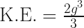
The velocity described by the equation of motion however is entirely in the vertical direction at this point on the curve and therefore this only represents the particle’s vertical kinetic energy. If we add the positive value for the horizontal kinetic energy, where did this extra energy come from? The curve violates a fundamental conservation law.

The particle would actually fly off the dome at some point because the dome drops away faster than a freefall parabola. If we wanted to we could work out the precise moment where this happens.

A stitch in time…

…violates casuality.

An equation of motion with a constant value for snap is still deterministic, even if it isn’t Newtonian. So where does the apparent non-deterministic nature come from?

Consider that the two equations represent different particles. One is a stable solution of the particle being at apex over all time. The other is an unstable particle which reaches the apex and leaves again. It’s not appropriate to combine these into a single equation since they don’t share the same state at the apex.

The particle suddenly starts behaving non-deterministically at time T because that’s the arbitrarily chosen point at which we ‘switch particles’.

We would never stitch two independent solutions together with different initial conditions since there’s no physical justification for this change of state.

Consider a much simpler case:

On a perfectly flat surface with zero friction, the horizontal force is always zero. The valid solutions to the equations of motion include the particle at rest:

 r(t) = 0

and the particle moving at a constant velocity:

 r(t) = vt

where v is arbitrary. These are both correct solutions (the latter being a generalisation of the first). Both of these solutions are perfectly Newtonian but they represent two different particles.

Can we stitch them together at an arbitrary time T?

 r(t) = \left\{ \begin{array}{cc} r(t) = vt & t > T \\ r(t) = 0 & t \leq T \\ \end{array} \right. 

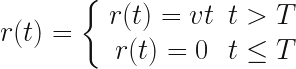
No, of course we can’t. Why? Because they have different initial conditions. Let’s say the velocity v = 50:

Newton / still Newton / constant v
position 0 0
velocity 0 50
acceleration 0 0

If we attempt to do this, we get an equally absurd non-physical and non-deterministic result in which the particle appears to suddenly move off at time T, in the absence of a physical cause.

Equally, it makes no physical sense to stitch these two piecewise together:

Newtonian / Stable Unstable / non-Newtonian
position 0 0
velocity 0 0
acceleration 0 0
jerk 0 0
snap/jounce 0 1/6

It is the stitch in time of two unrelated solutions with different initial values for snap that causes the apparent violation of causality.

What’s fascinating about this is that the equation for motion tells us that to fully describe the state of a particle, we need more than position, velocity and acceleration.

We have two possible particles: one is stable and remains in place at the apex. The other is the class of unstable particles which slide up to/down from the apex. [Note this is a class because snap is a vector. It has a fixed value but can be any orientation.  If we fix the orientation, then our model is back to representing one particle again and is fully deterministic (if not ‘Newtonian’).]

To remain Newtonian and preserve determinism, we can exclude the singular point by constraining the higher orders to zero whenever the net force is zero. We lose time symmetry for this special case if we do this. If we wish to keep that, then we have to accept that Newtonian mechanics is incomplete and consider higher order differentials.

Either of these approaches preserves determinism.

Curvature pathologies and red-herrings

I mentioned early that the dome curve had two red-herring properties.

The first was that it becomes “non-physical” beyond the point at which the curvature is vertical. This is hard to spot in the form given, but in Cartesian coordinates there are no (real) solutions to the equation past this boundary.

The second pathology is more mathematical but occurs at the apex itself where the curve has a singularity in its second order curvature. This has no bearing on the non-deterministic interpretation of Norton’s thought experiment, but it looks suspicious and so some people have fixated on it. It’s probably particularly beguiling the more mathematical training one has had, but I don’t think – as a physicist – it presents any special problems at all. We can reproduce the problem on a perfectly smooth curve easily.

The square root in Norton’s differential equation makes the other motion solution easy to intuit, but so long as we remember to all appropriate constraints we can banish that at the singular point of the apex.

David Malament has done an excellent treatment here, which is well worth a read. Overall this is a very insightful analysis though he incorrectly concludes the non-determinism is a result of the fact the Dome is not Lipschitz continuous.

Any potential with a singular maximum – smooth or otherwise – will have infinite solutions at the apex.

Nonetheless, Malament’s analysis is extremely thorough and adds an extra layer of richness to Norton’s Dome that I think it elevates its worth enormously.

Cartesian Equation for Norton’s Dome

Given the pathological behaviour of Norton’s Dome equation, I was curious to know what it actually looks like. No-one has drawn it accurately, not even Norton himself, which I found interesting.

We need to convert the curve from a relationship between the arc length and the height, to one between the Cartesian x and y coordinates. This is pretty straightforward to with some basic calculus. I’ll skip most of steps because the equations get rather messy in Cartesian coordinates, but by all means verify the in between steps yourself.

I’m going switch symbols, and use a more standard y for the vertical position as s for the arc length. The curve is rotationally symmetric around the origin so we can work in 2D without losing anything:

 y = \frac{2}{3g}s^\frac{3}{2}

To get a relationship for x, we just have to express dx in known terms and then integrate it over the region. Pythagoras gives us:

  {\displaystyle \int_0^x}  \mathrm{d}x = {\displaystyle \int_0^s} \sqrt{\mathrm{d}s^2 - \mathrm{d}y^2} 

re-express in terms we can substitute:

  x = {\displaystyle \int_0^s} \sqrt{ 1 - (\frac{\mathrm{d}y}{\mathrm{d}s})^2} . \mathrm{d}s

we know

  \frac{\mathrm{d}y}{\mathrm{d}s}  = \frac{\sqrt{s}}{g}

so substituting that and then integrating, we get:
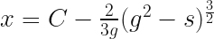
 x = C - \frac{2}{3g} (g^2 - s)^\frac{3}{2}

to find C we just apply x = y = 0, and then re-express s in terms of y, which yields

 x = \frac{2g^2}{3}  - \frac{2}{3g} \Big[g^2 - (\frac{3gy}{2})^\frac{2}{3}\Big]^\frac{3}{2}

Not pretty, but it’s plottable, so long as we stay in the valid domain. We can see the exact point where it goes vertical and that’s the farthest point the equation makes sense anyway.
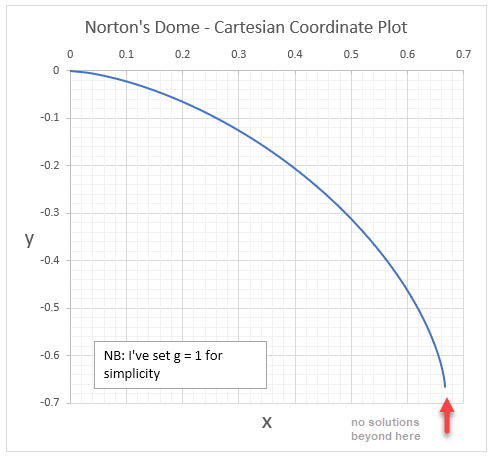
norton's dome - cartesian

Other Red Herrings

Norton’s original article considers a time-reversed version of his particle which instead arrives at the apex. I’m not entirely sure why, but he discusses a trajectory which takes infinite time for the particle to reach the apex. This has nothing to do with the trajectory described by his solution which is trivially be shown to reach the apex in finite time – (assuming we stay within the well-behaved bounds of the dome equation).

If we start at an arc length of 1/144 for example, it will run up the dome and arrive at the apex in 1 second. As we’ve seen, it has zero velocity and zero acceleration at this point, but moves off after anyway because it still has a positive value for snap.

Implications for Causality: none

Physical models are like maps, small, imperfect representations of something much larger. When we see a crease or fold on a map we don’t expect to see the terrain share the same feature.

It seems ridiculous to me that anyone would try to infer something about reality from the failure of a model. The domains where models fail say nothing about reality. They say only something about the model.

Smooth domes are just as badly behaved…

Consider any smooth dome shape with a singular apex.  Now consider a particle a little way down the side. If we give that particle exactly the kinetic energy needed to reach the apex and point it there, what happens when it reaches the apex?

According to Newton, the particle should stop in the absence of any net force, but as we’ve learned, Newton’s description isn’t complete. Time-reversibility tells us the particle continues to move. Equations of motion are always time-reversible, so the equation will be symmetric around t = 0. The particle must therefore either fall back down again or go over the other side. What’s wonderful about this version of the thought experiment is that we don’t even need to do any maths to see this is true!

It tells us two things:

  1. A particle won’t stay at the summit unless it started there, and
  2. Newton’s laws cannot be complete

If we think about particles’ states, and consider higher orders like jounce, snap, crackle and pop. (and all the way to infinity), we can see that the choice of path of unstable particles is fully determined by their values, so this isn’t evidence for indeterminism, it is evidence for incompletion.

Indeterminism is merely a consequence of ignoring these and stitching equations together that don’t actually represent the same particle or path. It is a failure to apply the model correctly.

I think this is beautiful and stunning result for a thought experiment.

The same holds for any classical setup. Consider two positive charges fixed in space separated by a short distance. We can place an electron somewhere on the line between them it will feel an electric force. At the precise centre will be zero net force, either side, the electron will feel a force attracting it to the closest positive charge.

The electric potential has a maximum in the centre so this is an unstable equilibrium too. If we we shoot an electron with precisely the right energy it will travel to the centre and, despite no net force move back again (or through) in a time-symmetric manner, once again proving the classical description incomplete.

A generalised result

We don’t even need to consider a specific shape or physical set-up to arrive at this conclusion. Norton’s dome has suggested an entire class of equations of motion which show classical physics to be incomplete.

We see the same results for any equation of motion that is:

  1. time-symmetric around t = 0
  2. polynomial form of order n \geq 3

We could consider these for example, without even caring what physical system they happen to be solutions for:

r = kt^3

r = kt^4

r = kt^5

r = kt^6

Position, velocity and acceleration will be zero at t = 0 for every equation of polynomial form of order 3 and above, but non zero everywhere else. Particles following these trajectories move to and from an unstable equilibrium where Newton’s laws fail to be fully descriptive at the singular point t = 0 where the implied force is zero.

We need to talk about K = viN…

Every tech entrepreneur dreams about making a product that goes viral, but true virality is as rare as a unicorn and poorly understood. A proper understanding of the viral coefficient, K, can give insights that enable a more systematic approach to maximising it. Because as far as virality is concerned, K is hiding something pretty important…

I’m going to distinguish different types of virality and go into detail about the various ways to model it. I’m also going to introduce the idea of “pre-virality” and why it shouldn’t be discounted. The stakes are high, viral growth means companies literally don’t need to spend a penny on marketing, and yet achieve explosive popularity and success. However, unless you have a maths background, virality can be quite counter-intuitive. (Beware, this article contains equations!)

My experience of viral growth

I’m no stranger to virality. I’ve been watching and playing with viral experiments since 1999. I’ve witnessed abject failures as well surprising successes. My interest began with setting up an experimental R&D team within moonfruit.com (a dotcom started by my two besties from Imperial, Wendy and Eirik). My team built intelligent agents to help people discover the web by learning how and what they searched for. The agent project never came to light (funding was pulled), but, on the way, we released two interactive desktop toys to test out some of the cool tech that we were building, and thought they would be good viral branding experiments. Neither went viral, instead they both quickly died out upon release. That was the end of that. A few years later, I noticed that suddenly everyone, it seemed, was inviting me by email to sign up to a web service called Birthday Alarm. It was clearly going massively viral. I didn’t know it at the time, but it turned out this was the brainchild of one of my physics classmates from Imperial. Michael had been experimenting both systematically and persistently, and finally hit a jackpot. He went on to create and sell Ringo and then Bebo, so it was well-worth the effort. Then in 2009, Wendy masterminded a simple but ingenious Twitter competition which went so viral that at one point more than 2% of all tweets globally contained the #moonfruit hashtag. Twitter actually pulled the campaign it was so disruptive. Interestingly, copycat competitions failed to go viral. More recently, I had a surprising, albeit smaller, viral success in 2015 when an article about how to learn a language quickly that I wrote on Quora suddenly started sending so much traffic to my latest startup, Kwiziq, that we upgraded our servers to cope. It was something I’d written months before and completely forgotten about. Unbeknownst to me it had been growing slowly and then suddenly, boom!

Virality is no easy thing to achieve – and certainly comes with no guarantees – but all my experience has shown me that it is possible to approach it systematically and tip the odds in one’s favour. I decided to write this article to pull together all my own thoughts and learnings over the last sixteen years because at Kwiziq we are trying to grow as virally as possible.

The classic viral loop

This is how the classic “viral loop” is generally viewed:

viral-loop

Intuitively, we see that, if the average number of people invited by each user, Nmultiplied by the percentage that accept the invitation, i, is greater than 1, then a positive feedback loop is created since each user effectively generates at least one more.

For this loop then, we define the viral coefficient as:

 K = i N 

This is a great starting point for understanding virality, but as we will see, the problem with it is that it obscures more than it reveals. As a result, it gives almost no insight into what to do increase K. We also mustn’t simply accept this is a good model for the realities of word-of-mouth sharing, without question, because a bad model will misguide us. We are need to understand the viral process in more detail.

Viral Models

All models are wrong,” as we physicists like to say, “but some are useful.

How we model virality for a product depends very much upon when and how people can and do share it or invite their network. Models are idealisations and therefore always wrong in some way, but they have two very important roles to play in a startup:

  1. They can help predict growth, but more importantly :-
  2. They give us insights that can guide product and process design

So the choice of model is rather important. There are two popular models which display very different behaviour and yet both mathematically model the same loop.

The Steady Sharing Model

The simplest model (often the starting point for more sophisticated models used by viral blogger Andrew Chen) bases growth on the idea that user base will always bring in a proportion, k, of new users (via sharing) every viral cycle.

Note that we don’t actually need to know what the viral cycle length is, but we’ll see how important it is later.

If we start with a number of users,  U_{0} 
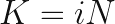
then the total number of users we have after one viral cycle, or  \Delta t is:

 U_{\Delta t} = U_{0} K

where  K = 1 + k

e.g. if k =15\% growth then K = 1 + 0.15 = 1.15

The number of users after an arbitrary time,t, is just this formula iteratively applied to itself  t / \Delta t times:

 U_{t} = U_{0} K^{(\frac{t}{\Delta t})}

This formula acts exactly the same as compound interest on a principle amount. So long as  k is more than zero, you’ll get some growth. But, the model is only valid if users do actually continuously share.

If we ignore network saturation for now – i.e. if we assume that for the first twenty cycles we still have plenty of room to grow – then Steady Sharing looks like this for varying values of K:

steady-sharing-model-k-behaviour

At very low values, there’s minimal contribution to growth.  Effects like this would easily be masked by any inbound or paid marketing channels. As K grows though, since the growth is exponential, the viral channel would soon make itself very clear indeed.

The Big Bang Theory

David Skok proposes a replacement model for Steady Sharing which I call the “Big Bang” viral model. In this model new customers invite / share to all the people in their circle of influence all in one go in the first loop of the cycle but then stop. The formula for growth in this model is slightly more complex, and  K here has a slightly different meaning.

If we start with a number of users,  U_{0} then if every new user subsequently successfully brings  K new users within one viral cycle, or  \Delta t is:

 U_{\Delta t} = U_{0} K

bringing the total users to  U_{\Delta t} + U_{0} .

(Note that K doesn’t have to be an integer – if a thousand users brings 33 more, say, then K would be 0.033).

Since only new users bring new growth, the equation for the number of users after time t is a little more complex:

U_t = U_{0} \cdot {K^{(\frac{t}{\Delta t}+1)} -1 \over K - 1}

(if you’re curious why it’s that, there’s a nice derivation here).

At large values for K, the two models behave in an increasingly similar manner (Steady Sharing lags by one cycle), however for low values (compare the graphs on the left for both models), the two mechanisms are starkly different:

big-bang-model-k-behaviour

A K value of 1.0 produces linear growth, above 1.0 produces exponential growth but below values of 1.0 this type of sharing dies out; the number of users reached approaches a limit.

Models versus reality

So, which of these models is true?

Neither. And both.

Skok claims the Steady Sharing Model is wrong, but it’s no more wrong than any other model. Which model is more accurate and applicable depends on the type of product, the user behaviour, and how sharing is enabled. Indeed, it’s possible for one, both or neither to apply.

Some products naturally support steady sharing – indeed multiple opportunities for users to share to the same people: content-based products like YouTube, for example. Others encourage Big Bang invites of entire contacts list, all in one go.

The Big Bang model is a very good fit for one-offs: articles, books, songs, videos etc. – things that people experience once and where there’s an immediate desire and opportunity to share but little incentive to return after. It’s also a good fit for products that haven’t achieved strong stickiness yet or where only one opportunity to invite people is given.

How do these models match reality though?

Learning from real examples

I don’t have enough data or insight for the moonfruit competition or Birthday Alarm, so I’ll pick two of my own examples.

Example #1 Desktop Toys

These were simple .exe files that we sent to a seed base of users – by email – and tracked the spread via code in them that pinged our servers when they were activated. They pretty much followed exactly the Big Bang model with a K value somewhere less than 0.5 (I can’t recall the seed user number exactly but we didn’t get a large multiple of the seed users). We were’t expecting miracles – we knew that sending a .exe install file was a pretty hefty ‘payload’ for a viral to carry and that a proportion of people would be suspicious (even though it was a harmless install).

We were disappointed naturally, but if I knew then what I knew now, I’d have had a better idea of how to measure and increase K.

Example #2 Quora article

The Quora also went viral in very much a Big Bang way, at first anyway, only slowing when it reached saturation in the primary network – roughly a million views (reaching what Chen calls the network’s “carrying capacity”).

However, the growth didn’t slow to zero as predicted by Big Bang.

In fact, it went pretty linear and still garners about 5-6k views a month which I’m more than happy with as it generally keeps me top of this list and continues to drive traffic to Kwiziq. In reality, it didn’t follow either model closely.

Why?

All models are wrong. In the real world, things are fantastically more complicated than our simple models. In reality, it’s quite likely that some users will be Steady Sharing (I know several teachers who share it ongoingly, for example), and others will Big Bang share when they encounter it; and others still who do both. It’s possible to a be a hybrid of both models.

Furthermore, and this is vital to understand, the source of new users (or readers in this case) is not limited to those generated by the sharing of the article. New readers are being brought in by Quora (internally via emails they send out highlighting popular articles, and via external search). They also get traffic from links from syndicated versions of the article such as these Huffington Post and Business Insider versions.

Neither of the models account for external sources to the viral cycle. In both though, this would add an extra boost to the number of users in any given cycle.

Finally, neither accounts for multiple sharing mechanisms.

The article gets shared by email, Facebook and Twitter as well, to name a few (Twitter being the most obvious to me as I often get an @gruffdavies mention).

So in fact, instead of one value for K, we really have one for each of channel and they will be different.

The important learning from this is that, even if the sharing mechanism is Big Bang and has a K lower than 1.0, if there are other mechanisms for introducing fresh users each cycle, then K becomes a magnifier.

Pre-virality

If we have external sources of users (paid or inbound marketing for example), then even lower values of K than 1.0 are potentially still hugely valuable. Values between 0.5 and 1.0 are what I called pre-viral and still well worth attaining, because each user then multiplies into more, even though the effect is self-limiting:

K value Multiplying Effect
            0.5 200%
            0.7 333%
            0.8 495%
            0.9 891%

Using models as a guide to design

Models aren’t just good for telling us how a product or service might spread, but can guide our tactics and strategies underpinning growth. They can and should guide product and process decisions. 

It’s clear that non-viral sources of acquisition should not be overlooked. Any web-based service is going to have SEO and paid marketing channels – and these channels can help to continuously feed viral growth mechanisms even when the K values are low. It’s also clear that, if possible, steady sharing mechanisms are going to have a huge benefit in the long-term.

There are obvious major learnings to be had immediately from these models, and a third which may be less obvious:

  1. Big Bang is better than Steady Sharing for high values of K, but Steady Sharing produces continual growth at low values, therefore the ideal scenario should support and encourage a hybrid of both.
  2. In Steady Sharing for all K, and Big Bang for K > 1.0 reducing the sharing cycle time has an extraordinary impact on growth because it’s exponential. Optimise for the shortest possible cycle times.
  3. K is actually the combined result of multiple steps of a funnel. Each step reduces K by a factor. So decompose K into its components and then optimise each.

All this brings me to the title of this blog post.

We really need to talk about K = viN

Kwiziq already supports multiple sharing mechanisms and one invitation mechanism (teachers, tutors or studygroup coordinators can invites students to join). We haven’t supported users-inviting-users yet but this is high on our agenda. However, it seemed obvious to me that, with respect to virality, because we only support one language right now, this dramatically reduces K.

The classic viral loop is missing a vital detail: relevance to the user. A user won’t even think about accepting an invitation unless the offer is relevant to their needs.  In our case, if they aren’t learning French then they won’t consider accepting. So the viral loop really looks like this:

viral-loop-including-relevance

Only a percentage of users invited, v will find the product relevant, of which a further percentage, i will accept, which gives us:

 K = v i N 

Very high relevance is a key reason that Michael had such success with Birthday Alarm – everyone has a birthday and everyone has people whose birthdays they want to remember. It’s the reason moonfruit’s twitter campaign was so successful – almost everyone wanted a MacBook and the “cost” of retweeting a hashtag to have the chance win one was negligible to the user.

We estimate that a third of the world speaks another language badly (essentially our market) which puts an absolute upper limit on v. In reality, though it’s much smaller currently: it’s whatever proportion of people are interested specifically in learning French. So clearly, offering as many popular languages as possible has the potential to multiply the current value of v (and therefore K) by significant multiples.  By comparison, any efforts to optimise the acceptance rate, i, are going to be limited and far harder to achieve per percentage point than expanding into new languages.

We already know it’s possible to achieve virality with more languages since at least three of the major players in the language learning space grew virally to 30M – 150M users over the space of a just a few years after they started offering the most popular languages.

Analyse Feasibility: the Kevin test

The K = viN equation lets us do a decent feasibility study on whether we even stand a chance at making a product grow virally. Let’s plug some values in. We first need to know the maximum potential values for each based on our knowledge of the product and the market. Note, these will be way higher than anything we could achieve, we’re just looking for an absolute ceiling value because if this figure isn’t viral then we can’t ever hope to achieve it. We’re a looking to see if our ceiling value is greater than at least ten here because we need to be realistic about achieving only 10% of the ceiling = 1.0 for virality), or there’s just no point. Next we’ll use what we think our current starting values could be and then, target values that we hope are attainable.  For N, I’m going to use the median number of Facebook friends people have as this is a published figure: about 200.  The mean figure is higher at 338, but we should always use conservative estimates.

For Kwiziq, then, the K = viN feasibility analysis looks like this:

Relevance Invite
Acceptance
Rate
Average
Network
Size
v i N = K
ceiling :  33% 50% 200 33 !!
est. starting : 5% 5% 200 0.5 pre-viral
target : 15% 10% 200 3 hugely viral

So, Kwiziq passes the “Kevin feasibility test”.

Detailed viral analysis

This is just the beginning of what we must do in analysing the viral loop though. It behooves us to understand every single step in the funnel, whether it’s a real step involving a physical action, or a step in the user’s decision process in their head. What we need is something reminiscent of the Drake Equation.

Here’s a an example as a starting point for a specific product viral loop, but in real life, this should be an ongoing process of identifying and optimising every possible step of attrition that can reduce  K, including the UX itself that could inhibit sharing at the top of this cycle.

kwiziq-viral-loop

There are fairly obviously a great deal of potential UX improvement steps between a user joining, wanting to and being easily able to invite others that will be worth careful attention.

Measure

“If you cannot measure it, you cannot improve it” – Lord Kelvin

One final piece of advice, measure everything. The minute you have a measure to track, you’ll start thinking of ways to improve it.

You may not always have direct measures (how do you measure real word-of-mouth, for example?) If, like Kwiziq, your product supports many different acquisition types and channels, and is a hybrid viral model, then you need to look for indirect measures that will indicate when they are working.

I would suggest you track something like the ratio of New Paying Users to New Registrations per week/month. This is especially revealing because paying users will contain most of your “sneezers” (they like your product enough to pay for it, right?). New users coming though viral channels will start to make this metric rise non-linearly at the beginning (it will eventually become asymptotic towards 100% if viral takes over). Your efforts to improve UX and address anything that’s reducing K ought to be visible here early. If your paying users are growing faster (at higher order) than new users, you’re doing something right!

For a “freemium Saas” product like Kwiziq, measuring the ratio of new paying users to all new users will reveal any viral contributions to growth before they become apparent in your overall acquisition measures

NB: you will need to understand and analyse any other mechanisms that can cause non-linearity here to be sure, but over time, a metric like this ought to detect viral growth well before it becomes visible in your overall acquisition metrics.


Good luck!

P.S. The flow diagrams in this blog post were created in seconds using Pidgin.

Use Pidgin for faster Flowcharts and Relationship Diagrams

I’ve released a new version of Pidgin (still in beta) this weekend, with some cool new features, but although I’ve used pidgin in posts before, I’ve never actually blogged its original release for lack of time.

Pidgin is (free) tool for people who, like me, aren’t very good at drawing and would rather a computer do that for them. If diagram tools are more of a fiddle than a help to you, then you might prefer Pidgin too.

Pidgin is a simple language for describing graphs, which it then draws for you, so you can focus on jotting down your thoughts instead of battling some drawing interface. It can now draw two useful types of diagrams: Entity Relationships Diagrams and (new this week), Flowcharts.

Entity Relationship Diagrams

These are specifically useful to software engineers, but in fact any hierarchy, tree or object graph can be drawn so these are for all sorts of things. In Pidgin, stick to the singular form of the things and then describe how they’re related, like this:

Car contains one Engine
Car uses Petrol
Engine contains many SparkPlug
Petrol is Fuel

Pidgin will then draw it for you:

34

Notice that has, uses and contains have a special significance in Object Oriented Programming, and they’re represented with symbols stolen from UML.  If you just  want a simple hierarchy, the stick to using has. You can also wrap entities in speech marks if you need more than one word to describe them. Here’s an example planning the menu structure for a website (but it could just as easily be an org chart):

"Homepage" has "Footer"
"Homepage" has "Top Menu"
"Homepage" has "Homepage Body"
"Homepage Body" has "Blog News Summary"
"Footer" has "Privacy Policy"
"Top Menu" has "1. About Us"
"Footer" has "Contact Us"
"1. About Us" has "1.1 History & Mission"
"1. About Us" has "1.2 Staff"
"1. About Us" has "1.3 Blog Recent Posts"
"Top Menu" has "2. Program & Services"
"2. Program & Services" has "2.1 Overview"
"2. Program & Services" has "2.2 Great Programme A"
"2. Program & Services" has "2.3 Great Programme Z"

50

You can create a wide variety of useful relationship diagrams like this, pretty much as fast you think – it’s a real time saver. See more examples of Entity Relationship Diagrams made with Pidgin.

Flowcharts – new!

Pidgin now supports a very simple flowchart syntax so you can describe processes. I haven’t bothered with the usual diamond, round and square box styles as I’ve always thought they make flowcharts messy and hard to read and they don’t add anything. Pidgin flowcharts are simple and clean to read. You just write then between steps and if you need a conditional step, simply write it before then , like this. (the condition can be anything):

EnterCar then StartEngine
StartEngine then "Did it start?"
"Did it start?" yes then DriveHome
"Did it start?" no then "Try again?"
"Try again?" yes then StartEngine
"Try again?" no then Panic
DriveHome then Done

Notice I’ve wrapped the conditional steps in quotes, this isn’t just because they’re more than one word: currently you must use speechmarks if you want to use a question mark.

89

Editing Pidgin – new code editor

The code editor has some powerful new features. If you double click an entity, the other instances are highlighted too.  You can CTRL-double click some or each of them to edit more than one name at once, which is super handy. To rename all instances of a token, CTRL-H for search and replace. (Be aware Pidgin is case sensitive, so MyEntity is not the same as myEntity – you’ll end up with a wonky diagram, if you do that.)

pidgin-token-highlight-and-multi-select

Pidgin is still very much in beta, so save your text and graphs if they’re important, just in case. It now catches many basic syntax errors and gives line numbers (but it doesn’t catch everything yet and sometimes you just won’t get a graph if you make a mistake):

pidgin-basic-error-help


New Display Options

There  are two new display options for graphs: layout and privacy. 

Private graphs let you elect to hide a graph from public lists (although, in fact, no graphs are listed anywhere yet, but this is something I intend to support in the future since it’s nice to share work.)

pidgin-display-options

Layouts by default are left to right (horizontally) vertical layouts are more readable for certain graphs:

90

That’s pretty much it for this release!

If you find it useful, or find any bugs or have any feedback, do let me know.

Gruff

Make your own AI Art with Deep Neural Networks

I’m seriously rubbish at drawing and painting, but who needs arty fingers when you can whip up your own AI to make fine art for you?

Back in 2010, when The Looking Glass Club was published, my then-agent had complained that the technology in 2035 seemed too advanced for just a few decades hence, but despite justifying this with The Singularity, even I’m surprised by just how much AI has advanced in the five years since. I gave a talk about AI at Imperial a few months ago, and demo-ed how Deep Neural Networks are starting to get scarily good at things that, until now, have remained firmly in the realm of human capability, like learning to play Breakout better than you without knowing anything about the game beforehand, and imagining trippy works of art.

Yesterday, I came across @DeepForger (a Twitter bot by @alexjc) that paints impressionistic versions of your photos by copying the style and techniques of famous artists. How’s that for living in the future?  It painted this amazing portrait of me in the style of Picasso:

gruff-picassoed

Okay, it’s not quite Picasso, but it’s really quite remarkable. It’s understood the stylistic essence of the art piece it was given and created something in a similar vein!

This extraordinary AI is an implementation of a neural art algorithm that was only published at the end of August!

Unsurprisingly @DeepForger has a long queue of commissions so I decided to have a go at creating my own AI Artist that I could whip into making art at will. If you want to do the same, here’s how I did it, and what I learned in the process, so that hopefully you can avoid some of the mis-steps I took.

I’m working on a setup that can handle bigger files as I write this, but here’s an Escher-inspired memorial of mum’s cat Misty, who sadly passed away a few days ago:

escher-misty

How to create an instance of “Neural-Style” on an Ubuntu VM

Neural-style is one of several implementations of Leon Gatys et al‘s neural art algorithm on github. If you know what you’re doing, and already have an Ubuntu server or VM, that link should be enough to get you started.

I’ve been experimenting with three different setup flavours:

  1. An Ubuntu VM running on VirtualBox on my laptop
  2. A more powerful Ubuntu VM created as a droplet on DigitalOcean
  3. An AWS GPU instance

I’ll give detailed steps here for the first two configurations, and you can find steps for setting up an AWS GPU instance nicely documented here. (UPDATE: the AWS+docker implementation caused me too many issues, but I finally got a GPU-accelerated instance up and producing amazing results; I’ll post at the end) First though, here are some important things that can save you some pain and why I tried all three:

Learnings/Gotchas – read these first!

The two main causes of pain were lack of memory and directory permissions.

Neural-style needs at least 4GB of RAM on the Ubuntu instance if you use the default settings. You can easily brick your VM if you don’t have enough (VirtualBox hangs and goes into Guru Meditation mode you have to start over). It has a mode which only needs 1GB RAM but it doesn’t give good results AFAICT.

You can get it to work with less RAM by setting the image_size switch to either 256 or 128 pixels (default is 512) but then the images are too small to be good.

If you’re using VirtualBox you can probably give the VM about 45% of the host RAM safely – more than this and you’ll run into trouble. This is why I ended up trying DigitalOcean and AWS although I did get eventually get a version working on my laptop too.

If you use Vagrant to set up your VM then make sure you run all the commands using sudo to avoid permission errors which can be arcane and hard to figure out.

The default mode of neural-style is optimised to use a GPU but there’s a switch to force CPU.

I found that VMs with lots of cores (whether CPU or GPUs) didn’t make the code run any faster so there’s no point renting a cloud VM with loads (e.g. AWS g2.2xlarge is enough). GPUs run the code substantially than CPUs though (because matrix ops are done directly on the chip).

Setting up a VM on DigitalOcean is far simpler than AWS but they don’t have a GPU virtualisation so they are quite slow, no matter how many CPUs you go for.

Step 1 – Spin up a fresh Ubuntu VM

If you use Vagrant and VirtualBox:

  1. On your host create a new directory for your project and then in powershell or cmd run vagrant init ubuntu/trusty64
  2. vagrant up
  3. You can either increase the memory before step 2, using the Virtual Manager, or poweroff and do it after checking your VM works.

Alternatively, if your home machine isn’t powerful enough, you can use DigitalOcean to create a cloud VM. Just create a new droplet with at least 4GB (preferably 8GB) based on Ubuntu 14.04 and SSH in. (Remember to use sudo for everything, if you’re not root which you won’t be in a VirtualBox machine.)

Then, follow these commented steps in turn to configure your VM (you have run each step separately, this isn’t a script but if anyone fancies knocking up a Chef recipe to do this, do share!)

# you'll need git
sudo apt-get install git

# 1. install lua package manager
sudo apt-get install luarocks

# 2. install lua just-in-time compiler 
sudo apt-get install luajit

# 3. install torch - a scientific computing framework for luajit
curl -s https://raw.githubusercontent.com/torch/ezinstall/master/install-all | bash

# 4. protocol buffers - google's data exchange format
sudo apt-get install libprotobuf-dev protobuf-compiler

# 5. install caffe - a deep learning framework
sudo luarocks install loadcaffe

# 6. to handle various image formats
sudo luarocks install image

# 7. a neural network library
sudo luarocks install nn

# 8. and finally, get "neural-style" from github repo
sudo git clone https://github.com/jcjohnson/neural-style.git

# 9. go into the directory you've just cloned
cd neural-style

# 10. Download the neural models that contain the art genius - this step may take a while
sudo sh models/download_models.sh 

You’re should be almost ready to make some art. You may also want to set up another shared folder for image resources, but I was lazy and just the vagrant folder on my host which was shared by default and copied stuff in/out of this directory as needed.

You will need a source art image for the style (in fact, you can use more than one but start simple) and a photo that you want to artify.

A headsup

Before you start, here’s what to expect if everything runs smoothly: we’ll use a verbose flag (-print_iter 1) so you should see steps as they happen, if things go quiet for more than 30s or so then check the state of your VM using Vbox manager to make sure it’s alive – if not, it’s probably run out of memory.

When neural-style is running, it starts by creating convolution layers which you’ll see in the output, and then after a few more steps, it should start producing image iterations. You need between 1,000 and 2,000 iterations for a good image. If you don’t see output like this with iterations every few seconds then something has gone wrong:

conv1_1: 64 3 3 3
conv1_2: 64 64 3 3
conv2_1: 128 64 3 3
conv2_2: 128 128 3 3
conv3_1: 256 128 3 3
conv3_2: 256 256 3 3
conv3_3: 256 256 3 3
conv3_4: 256 256 3 3
conv4_1: 512 256 3 3
conv4_2: 512 512 3 3
conv4_3: 512 512 3 3
conv4_4: 512 512 3 3
conv5_1: 512 512 3 3
conv5_2: 512 512 3 3
conv5_3: 512 512 3 3
conv5_4: 512 512 3 3
fc6: 1 1 25088 4096
fc7: 1 1 4096 4096
fc8: 1 1 4096 1000
Setting up style layer          2       :       relu1_1
Setting up style layer          7       :       relu2_1
Setting up style layer          12      :       relu3_1
Setting up style layer          21      :       relu4_1
Setting up content layer        23      :       relu4_2
Setting up style layer          30      :       relu5_1
WARNING: Skipping content loss
Running optimization with L-BFGS
Iteration 1 / 1000
  Content 1 loss: 2094767.343750
  Style 1 loss: 26350.109863
  Style 2 loss: 4467230.468750
  Style 3 loss: 1869238.085938
  Style 4 loss: 90886093.750000
  Style 5 loss: 12086.410522
  Total loss: 99355766.168823
   creating recyclable direction/step/history buffers
Iteration 2 / 1000
  Content 1 loss: 2094763.906250
  Style 1 loss: 26350.109863
  Style 2 loss: 4467230.468750
  Style 3 loss: 1869238.085938
  Style 4 loss: 90886087.500000
  Style 5 loss: 12086.410522
  Total loss: 99355756.481323

Finally: let’s make make some AI art!

If you want to do a small test run with safe options, try this (replacing the two image filenames with your real files):

# small fast images
sudo th neural_style.lua -style_image ORIGINALARTISTIMAGE.jpg -content_image YOURPHOTO.jpg -gpu -1 -image_size 128 -print_iter 1

If that works, then you can try something larger:

# default image size is 512 anyway, takes more memory the larger the file
sudo th neural_style.lua -style_image ORIGINALARTISTIMAGE.jpg -content_image YOURPHOTO.jpg -gpu -1 -image_size 512 -print_iter 1

If you absolutely have to work with less than 3GB available then you can change the optimiser but to get good results you’ll need to experiment A LOT more, and normalising gradients is recommended:

sudo th neural_style.lua -style_image ORIGINALARTISTIMAGE.jpg -content_image YOURPHOTO.jpg -gpu -1 -image_size 512 -print_iter 1 -optimizer adam -normalize_gradients 

UPDATE – AWS GPU-accelerated version with CUDA:

Docker seemed to complicate everything for me, so I went back and unpicked the dependences so I could you the plain install with AWS.

Here are the modified steps:

# follow these steps for AWS/GPU 
# http://tleyden.github.io/blog/2015/11/22/cuda-7-dot-5-on-aws-gpu-instance-running-ubuntu-14-dot-04/

# then follow ONLY the mount GPU steps here (not the docker stuff)
# http://tleyden.github.io/blog/2015/11/22/running-neural-style-on-an-aws-gpu-instance/
# and then the steps later marked optional

# you'll need git
sudo apt-get install git

# install lua package manager
sudo apt-get install luarocks

# install lua just-in-time compiler 
sudo apt-get install luajit

# install torch - a scientific computing framework for luajit
# (takes quite a while!)
curl -s https://raw.githubusercontent.com/torch/ezinstall/master/install-all | bash

# protocol buffers - google's data exchange format
sudo apt-get install libprotobuf-dev protobuf-compiler

# install caffe - a deep learning framework
sudo luarocks install loadcaffe

# to handle various image formats
sudo luarocks install image

# a neural network library
sudo luarocks install nn

# and finally, get "neural-style" from github repo
sudo git clone https://github.com/jcjohnson/neural-style.git

# (optional for GPU/AWS) install cutorch - a CUDA backend for torch 
# see https://en.wikipedia.org/wiki/CUDA
sudo luarocks install cutorch
sudo luarocks install cunn

cd neural-style

sudo sh models/download_models.sh

# you may need SFTP set up too - I assume you can work that out

# now you can paint FAST!
sudo th neural_style.lua -style_image style.jpg -content_image subject.jpg -print_iter 1

And this is the first result I got! Stunning!

yvette

And a much better Escher-cat:

out

Have fun! And share your art!

Gruff


A neat MySQL hack to create a VIEW with subquery in the FROM clause…

I’ve grown to love MySQL, but every now and then it has some strange restriction that temporarily stumps me. Then I discover a marvelous workaround and fall in love with it all over again.

This hack lets you overcome the restriction that you’re not allowed to have a subquery in FROM clause of a VIEW.  The trick is to refactor the subquery into a view of its own, which you can then join to in the VIEW you want!  The subquery is likely to be something you’ll re-use anyway, so this is doubly useful.

Here’s a worked example.

I’m working with some currency information for products that is (unfortunately) denormalised into columns instead of being Boyce-Codd normal form.  You see this a lot in databases as it can make front-end code easier, but it makes it hard to work with in SQL.

It looks like this:

denormalised prices

I’ve renamed and simplified tables and columns here to make the example clearer.

When payments come in, they’re in a specific currency and they may be discounted from the standard package price.  I want to create a view that gives me exchange rates so I can report total revenues in a common currency.  I need to use the exchange rate that reflects the prices stored in the packages.

I want to be able to join a payment that came in against a package with the effective exchange rate for that currency in that package, so I need a view that shows package_id, currency, per_GBP.

To get this, I want to join a list of active currencies with the packages, and do a CASE on each currency to give the ratio in question. Easy enough, it looks like this:

-- NB: this DOESN'T WORK
create or replace view exchange_rates as
select  packages.id
,       active_currencies.currency
,       CASE currency
            WHEN 'GBP' THEN 1.0
            WHEN 'USD' THEN price_usd / price_gbp
            WHEN 'EUR' THEN price_eur / price_gbp
            WHEN 'CAD' THEN price_cad / price_gbp
            -- etc
        END as per_GBP 
from (  select distinct currency
        from payments) as active_currencies -- unfortunately currently ILLEGAL in MySQL
join packages -- deliberate cross join
;

MySQL spits a dummy over this, but we can trick it into playing nicely like this:

create or replace view active_currencies as
select distinct currency
from payments
;

create or replace view exchange_rates as
select  packages.id
,       active_currencies.currency
,       CASE currency
            WHEN 'GBP' THEN 1.0
            WHEN 'USD' THEN price_usd / price_gbp
            WHEN 'EUR' THEN price_eur / price_gbp
            WHEN 'CAD' THEN price_cad / price_gbp
            -- etc
        END as per_GBP 
from active_currencies -- ah, that's better!
join packages -- deliberate cross join
;

Now, when to convert payments to a common currency (GBP), I just join to my exchange_rates view on the package id and the currency and then use the exchange rate to convert to GBP!

Since I’m likely to use active currencies elsewhere, it’s actually a bonus to have this view. I suspect this technique may be an alternative use using this hack with stored procedures to solve restrictions with VIEWs containing group/count aggregate functions.

Writing games in HTML5 and CoffeeScript combining Box2D and EaselJS in an OOP/MVC architecture

Crap. That was a mouthful.

There seems to be a huge amount of stuff on Her Majesty’s Interwebs about all of these topics, but very little explaining how to pull them all together into something coherent. There’s a shit-ton of bad code to copy to get something bouncing around on screen, but none of it cares about scaling well into anything complex.  And there seems to be a massive dearth of diagrams showing how anything connects together, whether it’s classes within libraries, or how you’re supposed to fit them together in your own code. I don’t know about you, but I can’t design anything without diagrams, so expect lots here.  In fact, let’s have one now.

A diagram about diagrams
There. I feel better already.

(If you want to sketch diagrams like this quickly to help you design your code, try Pidgin. It’s a cool little tool that lets you write out relationships and it does the drawing-y bit.)

Now, I’m fairly new to Javascript having spent most of my (front-end) programming life mucking around with languages designed explicitly for Object Orientation, not bastard sons of webpage scripts. Javascript was a bit of a shock for me. Not an entirely unpleasant one, I admit: I discovered the language was far more powerful and flexible than I had realised – but, having delved beyond dabbling with it, and faced with the challenge of creating something substantial that needs to combine two powerful 3rd party libraries like Box2DWeb and CreateJS, I have definitely decided Javascript is not for me. Its syntax is horrendously ugly and hard to read, its “gotchas” many and dangerous, and writing OO code that will be easy to maintain and DRY is just expecting too much from it.

Or perhaps me.

CoffeeScript

Enter CoffeeScript. It’s JavaScript, The Good Parts with a Ruby-like syntax. Excuse me a moment while I just fetch some Kleenex.

Let’s look at JavaScript versus CoffeeScript syntax around Inheritance for example. I’ve stolen this from the CoffeeScript site showing what you would write in CoffeeScript (on the left) needed to do what JavaScript is doing on the right:

CoffeeScript versus JavaScript for Inheritance
Okay, the death text might have been me.

There’s no contest.  Given this syntax (JavaScript’s) any benefits provided by Inheritance are just eaten up by the unintelligible, un-maintainable gobbledygook you have to write to get it.  We don’t need inheritance; we can always use composition to achieve re-use (and we still will), but there’s something very elegant about having your game entities extend an underlying class that (say) understands about being dynamic in a 2D world.

CoffeeScript comes with it’s own cons of course: it’s compiled, not run natively in browsers, so that means you have to have a build process. You can either have the build done by the server so you actually deploy CoffeeScript, or you can build as part of testing and deployment.

EaselJS and Box2D libraries

If you’re just hacking around and trying to get your head around either EaselJS, and/or Box2D, and you’ve never tried CoffeeScript, you might want to just go ahead and get something working first using JavaScript (that’s certainly what I did). To write CoffeeScript, you need to understand JavaScript anyway (it compiles to JavaScript after all), and you have enough on your plate to learn as it is. It’s a challenge to take powerful libraries for display and physics and combine them in a way that won’t make you cry when you look at your code in a year’s time (also what I did). I’m going to assume that you care about writing code that’s nicely architected and easy to maintain. If you don’t, you’re reading the wrong blog post.

I’ve chosen to work with EaselJS (part of the CreateJS suite) and Box2Web (for now) but the real challenge here is actually independent of the choice of libraries. It’s not about which one you choose to render graphics and which one you use to handle physics, but how to combine them well. A decent game architecture should allow you to switch either fairly easily, and also port your game to different platform, like a specific mobile device (iOS/droid) or a platform-independent SDK such as Corona.

The Model-View-Controller Pattern

This is where MVC comes in. Model-View-Controller is the architectural design pattern adopted by web frameworks like Ruby on Rails and CakePHP. It’s more of a principle than a specific architecture, since it can take different forms depending on what you’re actually building. A game is not a web application built around a relational database, so the architecture of a game isn’t going to look exactly the same as a web system. However, the real principle at the heart of MVC is Separation of Concerns.

Now, I’m not actually an architecture purist – I firmly believe there is a balance to be had between writing beautifully architected code and getting something built and shipped. I am a big fan of Lean. There is absolutely nothing wrong in my view, in hacking some hideous Frankenstein of code together to get something working and out there. Software architecture isn’t like building architecture; its beauty is not on display for all to admire. I do think though, that once you have something out there, it is worth thinking about how you can refactor it so that the code is easier to maintain and scale. (It’s not even about code re-use. To paraphrase Matz, it’s not about achieving perfection, it’s about how you feel when programming. I don’t mind hacking prototypes to get something working or to learn how something works, but I hate working with that code afterwards.)

Productivity not purity

MVC comes with its own overhead in terms of number of classes, complexity and messages being thrown around. It’s interesting that MVC hasn’t been widely adopted (apparently) in games industry projects is cited as A) performance (probably true) and B) the fact that the Model in games is often “the same as the View” (partially true e.g. if you have a dedicated GPU for rendering then you may well rely on its ability to other fast vertex operations like collision detection which breaks MVC completely). In a web game though, the model can be properly separated from the View.

Remember though, it’s not a perfection or purity of this paradigm but getting the benefits of the underlying principles of Separation of Concerns.  Architecture is a function of project scale, not just the technologies involved: If you’re planning something tiny, it’s certainly overkill to go for a fully OOP and MVC design, but you should still about separating concerns and writing modular, DRY code. The great thing about libraries like EaselJS and Box2DWeb are that they are already dealing with separate domains. EaselJS is all about the View. Box2D is all about the Model.

So, is your game code the Controller? Hmm, no. It’s all three, and mostly Model, in fact.  We need to understand what MVC really means. What is each part concerned with and how do they interact? I keep seeing diagrams showing MVC that are wrong.  Let’s fix that now:

MVC
Note: those diamonds are not arrowheads. They’re UML… the lines point away from the diamond.

However the responsibilities of Models, Views and Controllers, the dividing lines of the separation of concerns is very different in a game than it is in a web-application.  The decision about what goes where. For example, visual effects, like particles, will probably use the physics library but really they’re View code because they’re not truly part of the game Model.  The game is independent from them. They’re visual gloss. They could be rendered completely differently without affecting the game.

Controllers

Controller classes are all about handling action input from the User. This can get a little fuzzy when we consider that this can include input from elements from the screen, e.g. like on-screen buttons, but remember even when the user taps a button on screen, it’s the touchscreen on top of the View that’s handling the touch.  Controller classes are responsible for responding to the User’s desires and making the internal game state change appropriately. This includes creating the game world in the first place when the User clicks ‘play’.  Controllers don’t necessarily fire events or call methods on Models – they can also be polled to get their state.  You can use both: i.e. your game start button’s click event can call Game.start() but during the game, you might want to know if the left key is down or not during a game tick to decide whether to apply a force left to your hero. You poll the keyboard controller for this information.

Models

The Model classes are all about representing the internal state of the game and the logic about changing state. So that’s the physical world itself and its contents, and all game elements in play.  This is more than just the physics; physics is just part of the game logic.  Notice that although the Model is not concerned with rendering, it does “update” the View.  All this means is that it is responsible for the telling the View what’s changed.

Views

View classes are only concerned with rendering things so the user can see them.  We should also include in the View anything sense-related actually, so that means audio too.

To MVC or not to MVC…

If you’re planning to port your game to run on different platforms, or you’re not sure about which libraries you’re going to use for physics or rendering, then you will probably want to be very clean about keeping these domains decoupled.  In other words, you will want write your own classes to wrap around any library classes.  Remember, we’re not just Separating Concerns for fun, we do it because it will make life easier and coding more enjoyable. If it is going to make things harder overall, don’t do it!

In a (business) web application, separating the model and view is easy because there’s usually nothing visual about the business model. Games are intrinsically visual: the view and model are coupled, and there’s no escaping this.  It’s a question of loose-coupling versus tight-coupling.

If, for example, we create a BallModel class that contains a Box2D ball body, and BallView class that contains the EaselJS Bitmap. Any calls from BallModel to update the view go via BallView, so your model is now competely agnostic about which library you choose.  If we have these inherit from base classes that do the common stuff, then we can benefit from Polymorphism.  So we associate our base ObjectModel class with a base ObjectView class and ObjectModel.update() can call ObjectView.update() which will do standard transformations of the physics coordinates to pixels (say).

Now if we decide to switch to a different graphics library, our code changes are all (hopefully) contained in our View classes. The same goes for your physics engine.  You will need one class at least that knows about both in order to convert from model units (kg/metres/seconds) into view units (pixels). This could be a helper, but it’s also reasonable to have it handled in the View. It’s the View’s job to render the Model.

MVC in games therefore is going to look broadly like this:

Model-view-controller pattern in games

Controllers will kick off the game and handle user input during it.  The models will concerns themselves with the (internal/invisible) world of the game, and the views will make it all visible to the user.  Each of these domains (MVC) should have a nice class hierarchy for nice modular code, not just our own code, but 3rd-party library code.

This is all very abstract, let’s have look with some concrete examples to see what the challenge is working with real libraries.

First off, EaselJS.  EaselJS is a brilliant library that makes graphics and sound in HTML5 really easy. It interacts with a <canvas> element in your HTML document.

How EaselJS works in an HTML doc


I’m using “is” here to show inheritance.  I’m only showing the core visual classes here, there are dozen more that do all sort of fancy things like image filters, event handling etc.  I’ve also included some other libraries provided by CreateJS as you’ll almost certainly need them.  You can just include the EaselJS library on its own if you prefer.

Easel has a Stage which represents the Canvas in your HTML doc.  It is (inherits from) a Container which both is and can contain DisplayObjects. There are classes like Bitmap and Sprite (animated bitmaps) which are DisplayObjects. The documentation for EaselJS is excellent although lacking lovely diagrams like this one to help see how it fits.

Now let’s look at Box2D.  The architecture of Box2D is pretty much platform-independent so it shouldn’t matter which port you use, or whether you read the (excellent) C++ manual even though we’re using JS/CoffeeScript.  Box2D is a fully-fledged rigid body physics engine. It’s complex. I’m going to assume you’re fine with that. I’m not going to be covering all the details of Box2D here, only the bits needed to work out how to create an HTML5 game architecture with it and EaselJS.

So, while Box2D is actually in three modules (Common, Collision and Dynamics) I’m just going to look at a small part of the Dynamics to get started.

Box2D basics

Box2D worlds are the corollary of our Stage in EaselJS (but can be bigger).  Then we have bodies which are rather more complicated than our Bitmap / Display Objects from EaselJS.  Box2D separates physical concerns into three classes for objects.

Bodies are concerned with having positions, moving about, rotating, responding to forces etc. but they’re a bit like ghosts; they don’t have a shape or material.

Fixtures add material properties to a body (so it’s like telling a body what it’s made of, how dense the material is and how springy for example).  Fixtures also have a Shape, which in turn tells the body how large it is.

Shapes are all about collisions.  They determine the edges and extent of bodies and therefore how they interact with other bodies/shapes.  Shapes are also the most tightly-coupled concept in our Model to our View, because normally our graphics will need to match our shapes. There’s no escaping this. It’s nothing to worry about.  Our models are responsible for creating and updating their views.  I.e. initiating and causing those events. They’re just not responsible for the details of what happens inside them.

Notice that a body can have more than one fixture.  I.e. you can create compound bodies by fixing (say) a rectangle and circle to a body.  These two shapes will never move with respect to each other.

We don’t actually need to add anything else to get a basic physical system going.  We could add Constraints and Joints to our world to remove degrees of freedom or join bodies together, but let’s leave that for now. It’s detail we’re not concerned with yet.

The Box2D world doesn’t come with its own ticker.  Once we setup the rules (gravity etc.) we call world.Step() with some parameters to run it one timestep.  This ticker is provided by EaselJS, so here the GameApplication View will be asking the model to update itself.  The model in return will update all of it’s entities and they will all communicate those updates back to their Views.

Hopefully, you’re starting to get a clear sense of how to organise your code.

In part 2, I’m going to get into the details of a class hierarchy that brings all this together with examples.

How to write DRY SQL in MySQL – Part 2: Stored Procedure Hacks

In Part 1 we looked at using VIEWS to keep our SQL DRY. Unfortunately, there are cases when VIEWS are either not allowed or perform terribly and can’t be optimised.  Stored Procedures are, of course, the mainstay of writing DRY SQL, and optimisation.  Unfortunately, you can’t treat the result set of Stored Procedure as a query; therefore you can’t join stored proc results in queries and so developers often end up having to copy their SQL leading to WET code. However, there’s a neat little hack which effectively lets you treats stored procedures like views.  It’s a little more work, but it’s worth it.

There are some very common queries that MySQL doesn’t support as VIEWs:

1. Any query that contains a subquery in the WHERE clause. E.g. where myfoo not in (select foo from bar). Fortunately, you can usually rewrite these using a left join and then filter any rows with nulls on the right hand side.

2. VIEWs that contain group/count aggregate functions cannot be made to use ALGORITHM=MERGE.  THIS IS BAD, especially if you naively forgot to set the algorithm, or just didn’t know about them: MySQL will happily build the view using ALGORITHM=TEMPTABLE instead of merging it with your query at runtime. If you have a generic query that covers a large result set, you won’t be able to use a view without bringing down the whole system!  You might not even notice this is happening if the project is new and as your data grows it’ll come back and bite you in the ass.

It’s pretty likely anyway that you will want to encapsulate, or already have encapsulated, complex queries in parameterised stored procs, so making them work like normal queries is incredibly useful and keeps your SQL DRY.

In order to make sprocs joinable, we can take advantage of temporary session tables.

Temporary tables stick around as long as the session is active, unless you explicitly drop them. So, instead of returning the result set from a stored procedure, we just put the results into a temporary session table, and whatever calls the sproc will have access to that table.  We can parameterise the sproc to keep the set small, and we can have queries as complex and procedural as we want!

This little hack will even work with your middleware code so long as it’s capable of running complex SQL (i.e. more than a single statement).  This is almost always the case.

Here’s an example:


DROP PROCEDURE IF EXISTS sp_create_tmp_myquery;
CREATE PROCEDURE sp_create_tmp_myquery(  )
BEGIN
-- this sproc creats a session temp table for use OUTSIDE the procedure 
-- essentially allowing DRY reuse of the query 
-- if the query or sproc calling this doesn't drop the temp table it'll be dropped in the next call 
-- to this sproc or when the session closes
  
  drop temporary table if exists tmp_myquery; 

  create temporary table tmp_myquery
  as
  -- some complex sql. Knock yourself out.

END;

-- to use the sproc:
call sp_create_tmp_myquery();

-- work with the results 
select foo
from   bar
join  tmp_myquery on <some condition>;

-- or just select them
select * from myquery
-- drop the table explicitly; not necessary but cleaner
drop temporary table if exists tmp_myquery; 

You’re not limited to a single data set either. If you want or need to, you could create multiple tables in the sproc and work with them after.

%d bloggers like this: